

Colour doesn’t sit still.
We’ve got better at choosing colour. We’re still learning to see it.

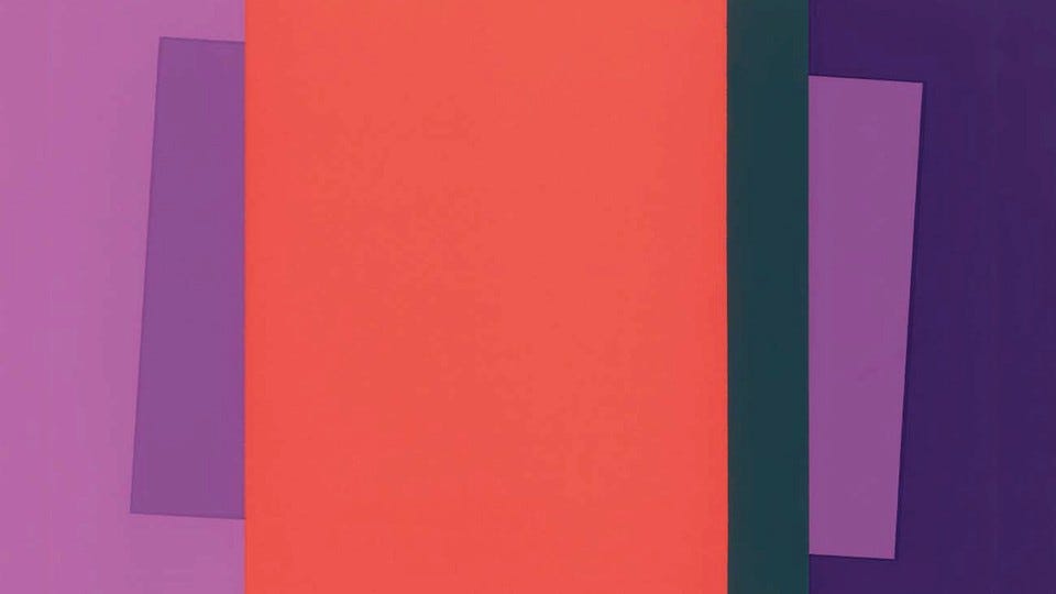
Take a look at the image above. The two inner violet colours are identical. They don’t look it. One appears darker, the other lighter. We can stare at it as long as we like—our eyes won’t let us see them as the same.
This is the point renowned modernist artist and colour genius Josef Albers was making in Interaction of Color (1963). Colour, he insisted, is not stable. It doesn’t sit still. It shifts, continuously, in response to whatever surrounds it. Violet is not just violet.
“In order to use color effectively it is necessary to recognize that color deceives continually.”
We don’t tend to talk about colour like this, in fashion.
We talk about colour in terms of selection: trends, ‘harmonious’ palettes, what ‘suits’ us and personal preferences. More recently, we’ve gotten better at thinking about colour combinations. Systems like Tibi’s colour wheel (here and here) push beyond trends into composition—pairing across “rings,” thinking about contrast, using ideas like “One, Ton or None” to create focus or calm. It’s useful. It gives us a way into colour play.
But it still largely treats colour as something we choose, rather than something that does things.
And behaviour is where things get interesting.
A colour has many faces
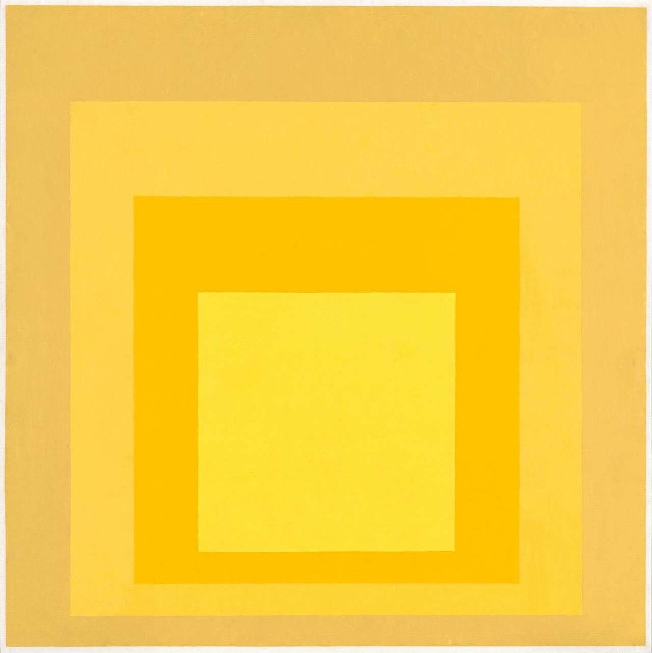
Albers’ colour play exercises aren’t about finding the ‘right’ colour. They’re about watching what happens to a single colour when you change up its context. Place it near this colour, it dulls. Place it on this brighter shade, it sharpens. Place it beside something close in value, it dissolves.
“…that change is a result of influence… It is discovered that certain colors are hard to change, and that there are others more susceptible to change.”
A colour has many faces. Not metaphorically—literally.*
This is easy enough to see on paper. It’s harder to recognise in a wardrobe, where we’re working in 3D rather than 2D, and everything is moving: our colouring + bodies, fabrics + light, and our actual environments.
BUT the same rules apply. A red knit doesn’t read as “red.” It reads as red + context e.g. red next to navy, red against skin my tanned skin, red under the cold LED office lighting, red against an overcast winter’s day, red in a crowd of black coats, red next to hot pink on a bright and sunny day. You get my drift.
The colour hasn’t changed. The + context means its effect has.
*If you want to nerd out on colour, Albers’ book is more workbook than textbook. It comprises a set of really accessible exercises for learning how to ‘see’ colour and understand colour. Highly recommend (pdf here or buy).
My Way Back Into Colour
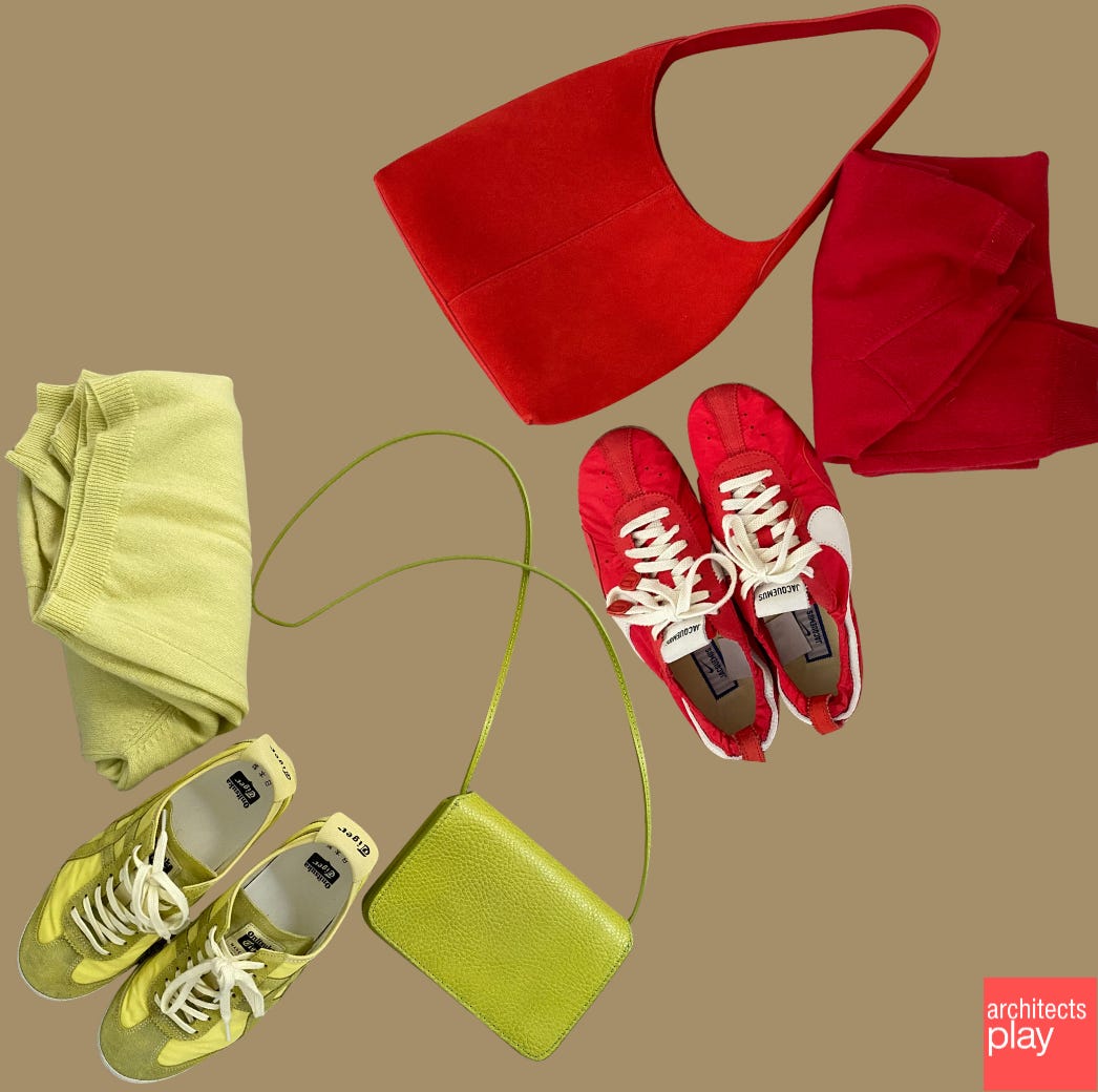
Over the past few years, my way back into colour was what most of us are told to do: a pop. A red shoe. A chartreuse knit. Something bright dropped into an otherwise neutral outfit. When I felt like more than neutrals, this worked reliably enough.
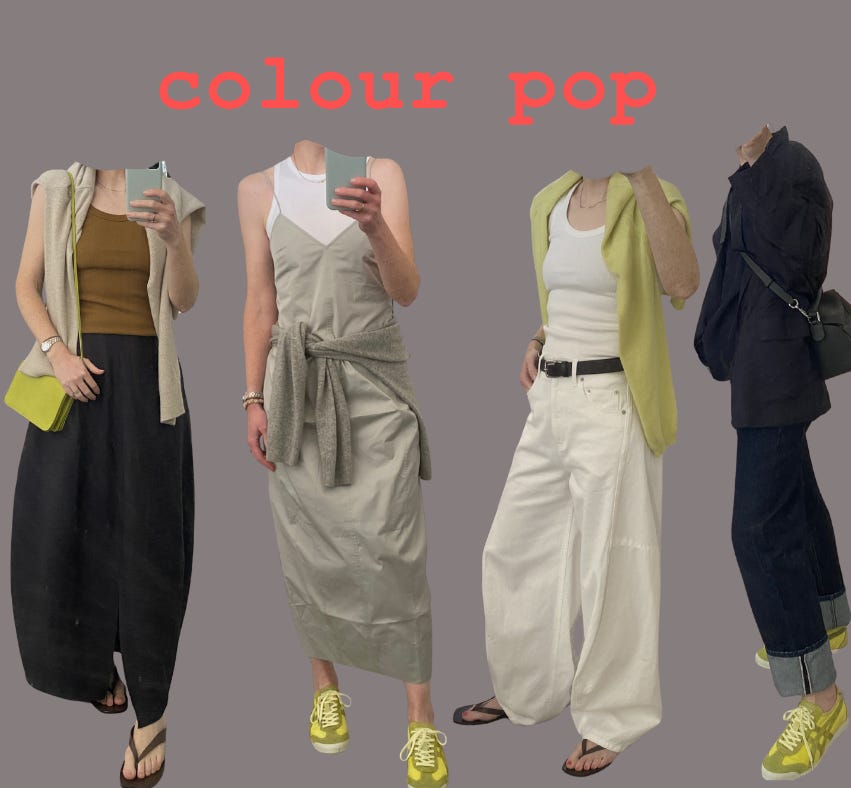
Looking back, it wasn’t so much the colour, singularly, doing the work. It was that little bit of colour, plus everything around it, that enabled the ‘pop’. It was the red or chartreuse set against a sea of neutral pieces that made these bright colours stand out.
These pieces work great for a ‘pop’ and I still love this option when I’m feeling it. But I’ve also found that these brights were a gateway into much more colour play. And the more you play, the more you realise it’s a pity to always stop at ‘pop’. Put that same chartreuse into a more saturated outfit and it stops reading so much as a ‘pop’. It settles down. Or it clashes. Or it fades into the background. The colour relationships have shifted.
We tend to describe this kind of colour play as confidence with colour. I’ve come to think it’s not really that, but more a growing sensitivity to colour interaction. And from that, more seeking and exploring colours combos beyond the neutral mainstays, beyond expected pairings.
What Tibi’s Colour Wheel doesn’t capture
Systems like Tibi’s colour wheel are useful for a reason. They move us beyond trends and into composition—pairing colours across “rings,” thinking about contrast, building a palette with some intention. For many, engaging with colour through Tibi’s wheel or other colour ‘systems’ is the first time colour starts to feel like something we can work with, rather than something you either ‘get’ or don’t.
A super quick primer on the Tibi colour wheel. (Just skip ahead if it’s familiar.) Think four colour groupings arranged in rings: Ring 1 comprises just black. Ring 2 comprises all your standard neutrals (navy, grey, white etc). Ring 3 comprises all your so-called ‘no-colour-colours’, that’s to say colours that are tricky to describe e.g. a reddish brown, a blue-ish khaki etc. Ring 4 is all your bright and pastel colours (red, blue, pastel pink, pastel blue, etc). Any combination of Rings is a-ok, but, Tibi argues, different combinations of different rings yields ‘different results’ AND the greater the distance between rings (e.g. Ring 1 + Ring 4) is going to give you higher contrast; so approach that with caution (e.g. black + red) AND Ring 3 is often overlooked, and can be ‘the glue that pulls together a closet’.
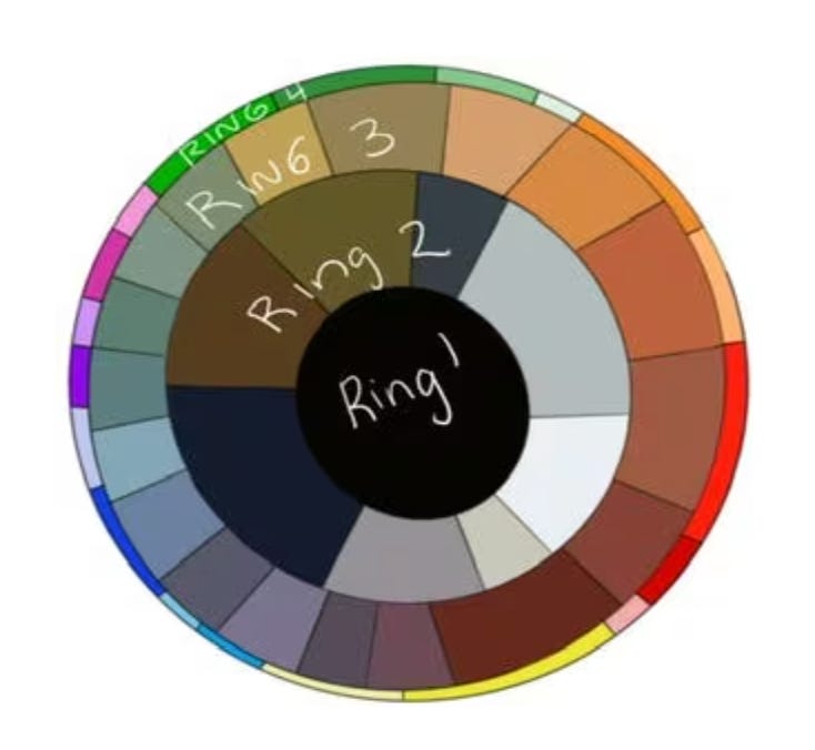
Tibi’s Amy Smilovic says: “If you wear a lot of black, slowly work outward on the wheel. Conversely, if you have a lot of color, work inward. Keep your blacks, keep your colors, just bring the new shades onto the body at the same time, all at once. Also, the further away your colors on the wheel, the sharper the statement. A black pant (Ring 1) and red top is quite bold. A tan pant (Ring 2) and green (Ring 4) is quite classic. But, when you combine a navy pant (Ring 2) with a purple-ish grey (Ring 3) the effect is soothing. Same with mixing a ring (3) olivey-green with mint (Ring 4), it conveys depth and richness.” (Source)
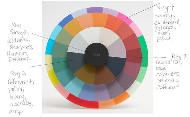
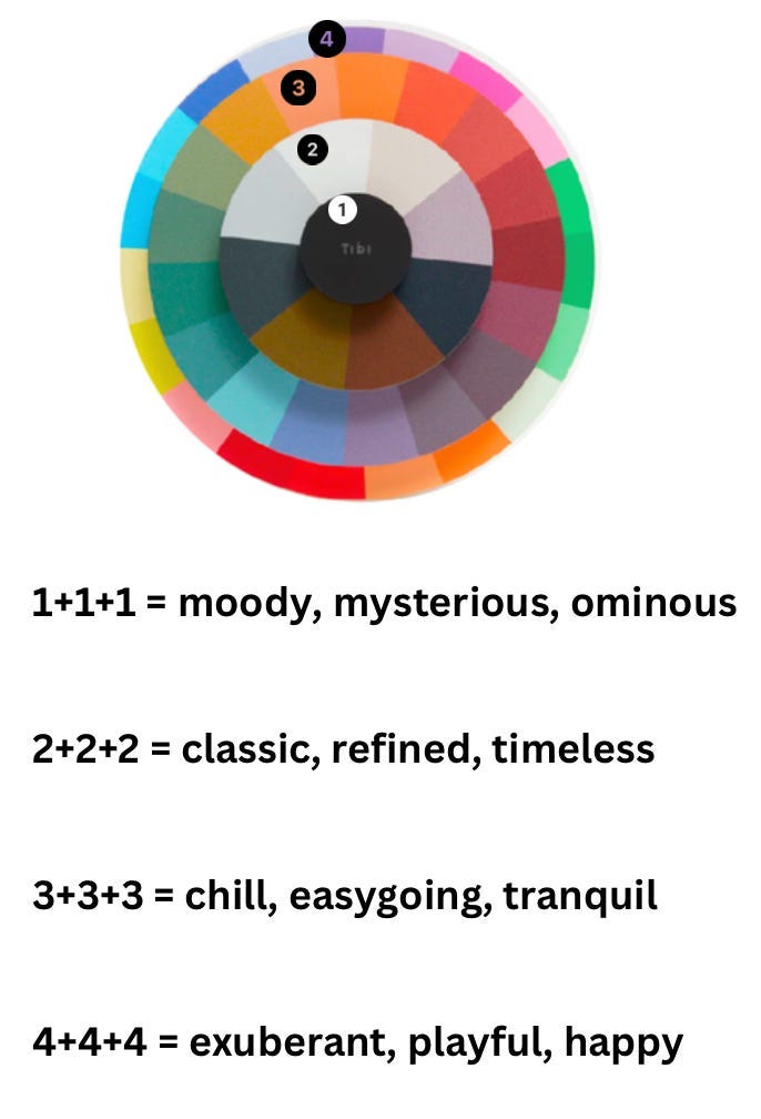
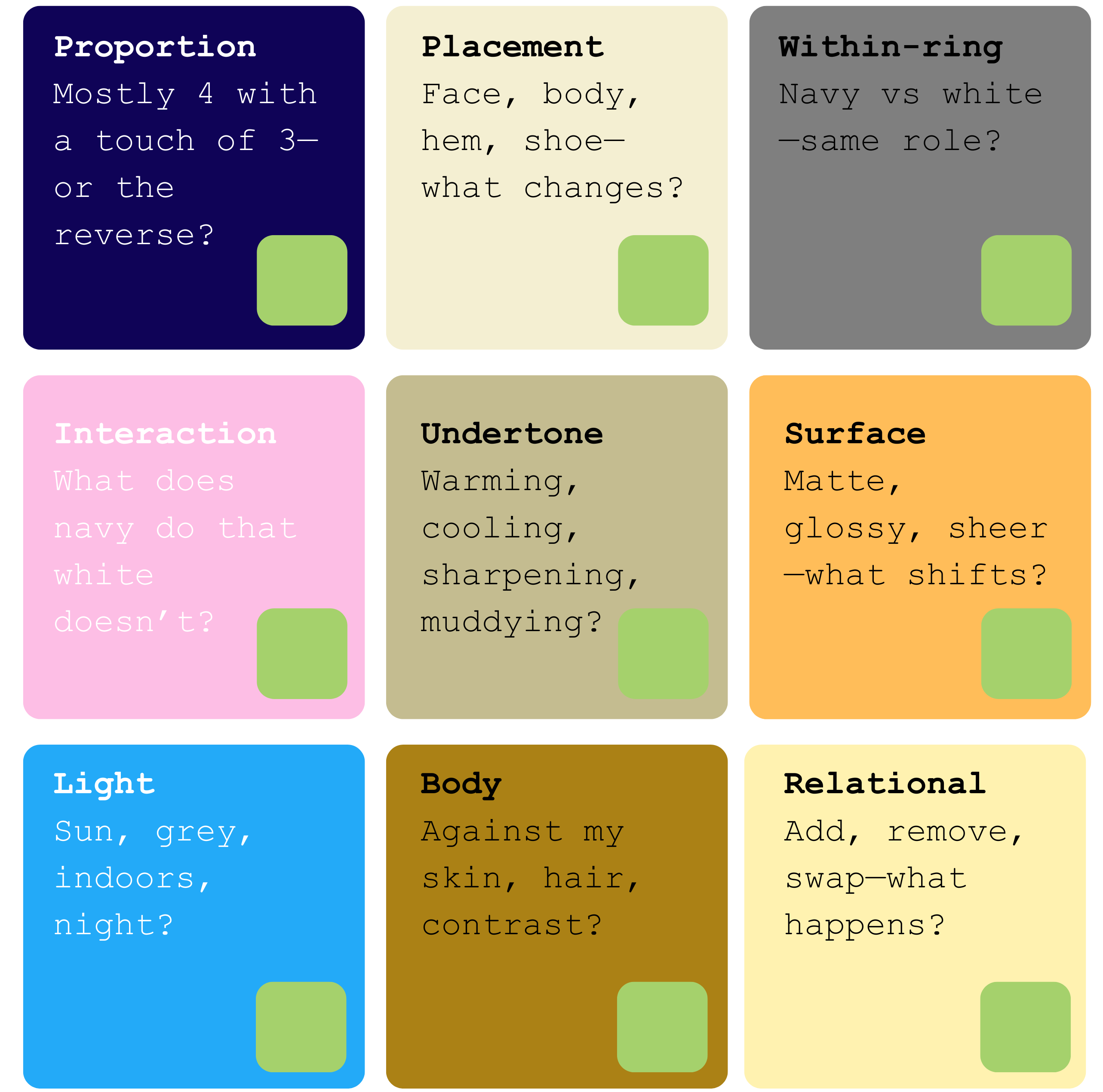
But while there’s much to love about Tibi’s colour wheel, it’s necessarily doing something quite specific. It’s helping us choose colours. It doesn’t tell us very much about colour behaviour. It leaves us with questions, such as:
What changes when I do mostly Ring 4 with a pop of Ring 3, or mostly Ring 3 with a pop of Ring 4?
What changes when the colour sits nearer the face, through the body, or in the shoes or bag?
What changes when I pick different Ring 2s (say a navy instead of a white) when paired with other Rings?
What does navy do to pastel pink that white doesn’t? What does navy (Ring 2) do to red? What does white (a different Ring 2) do to red?
What undertones does this particular colour have? And does it warm up, cool down, sharpen, or muddy other colours I pair it with?
How does materiality (matte, glossy, textured, crinkled, sheer) change the way my colours interact?
What does this colour look like in the sun, grey weather, indoors, or at night?
How does this colour feel and look against my skin, hair, eyes—and how much skin is showing?
How does this specific colour change when I add, remove, or combine another colour?
In short, Tibi’s colour wheel has far less to say about some key aspects of colour behaviour.
Tibi’s wheel doesn’t account for proportion: how much of a colour we’re wearing, where it sits on the body, whether it’s a small accent or a dominant field. It treats colours within a ring as relatively interchangeable, when in practice a navy, a charcoal, and a cream will all pull something very different out of the same “pop” colour. It doesn’t say much about undertones—warm and cool shifts within a hue—and how those shifts can either sharpen or dull a pairing. And, most importantly for us here, Tibi’s wheel doesn’t really deal with the fact that colour is not stable. Put one colour next to another and it changes. Sometimes subtly, sometimes dramatically.
We might summarise some of what’s missing in the wheel as follows:
Not convinced about that last point, on the slipperiness of colour? Scan down the balls of yarn on the left, see ‘Dusty Moose’—it’s a light brown, right? Now scan down the right hand column, see Dusty Moose—still see it as light brown?
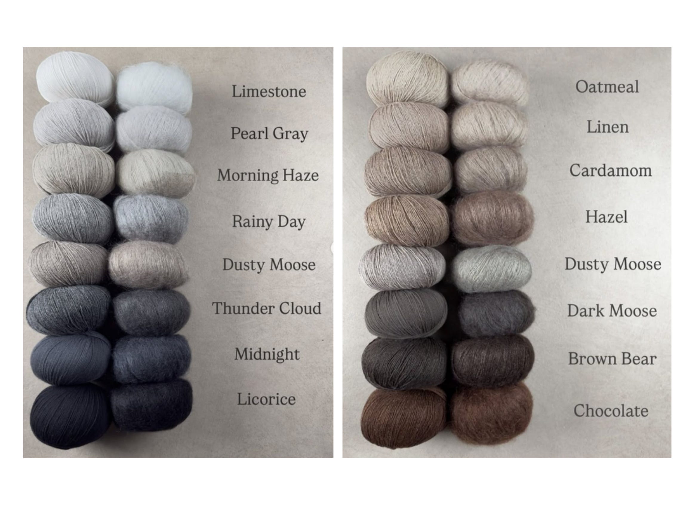
A brighter colour can push something duller into the background. A softer tone can suddenly look sharper depending on what sits beside it. This is precisely the point Josef Albers was making: colour is not a fixed property of an object, but something that happens between things.

Tibi’s colour wheel also operates, necessarily, as a kind of flat diagram. But clothing isn’t flat. It’s layered, textured, moving. A matte knit doesn’t behave like a glossy patent leather. A sheer fabric doesn’t behave like a crisp nylon. The same colour worn against bare skin will read differently when it’s worn as your outerwear layer. Context, context, context….it’s just hard to get that all summarised into a neat little wheel.
None of this takes away from Tibi’s wheel. It’s an intuitive heuristic to get started with colour play; it was for me, at least. But the wheel also obviously doesn’t fully capture the complexities of 3D colour behaviour.1 It’s not an endpoint for colour play.
Colour is not a universal language
A phrase on Tibi’s website claims “colour is a language”—and I understand what it’s getting at. But also, language implies some degree of shared meaning.2
Does that Ring-4 red look/read and feel precisely the same in London and Sydney, in an office and on a beach, in the depths of a gloomy winter or on a hot summer’s day, framing the faces a deeply sun-tanned brunette or a pale freckled-skinned strawberry blond?
I’d suggest it doesn’t.


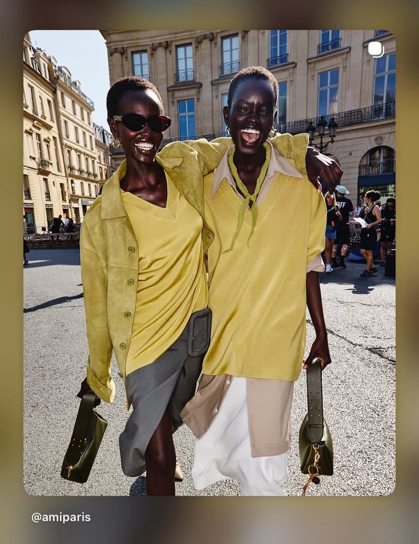
The very same shade of red or chartreuse is never just red, or just chartreuse. It reads differently against different colour pairings and against different skin tones and hair colour (see those gorgeous Ami Paris models above!!)—not necessarily better or worse, just different. And there are places and environments where chartreuse sharpens to almost fluorescent (think London on a dull and overcast winter’s day), and others where it flattens out completely (think Sydney, peak-summer with bright sun and vast blue skies). Anyone who has woken up in both of these cities and dressed for the day, may have felt this, intuitively. We adjust. We recalibrate. Context works on us, including in the every-day act of dressing.
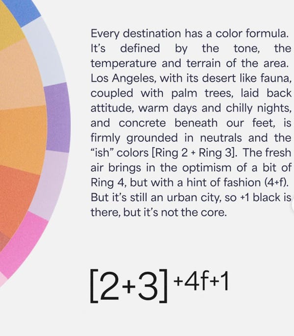
Nevertheless, Tibi’s ‘color formula’ for cities assigns combinations of its colour wheel rings to places—from LA to London to Hong Kong. It’s meant to be a helpful shortcut, particularly if you’re arriving somewhere new. I get that. It’s an interesting idea.
But we don’t converge on a single colour formula, I’d argue. If a city really had a fixed colour logic, you’d expect to see it reflected in the people who live there. You don’t. Residents use the full range of ring combinations, if they’re so inclined. Visitors are given the equation.
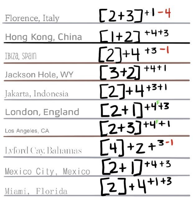
And to be clear, I’m not denying that different places have different ways of dressing. They do. In Australia alone, Melbourne fashion has a reputation for “all black” and dark neutrals, while Sydney—and certainly further north—is associated with brighter, lighter, more saturated colour play. Colour is part of that. But so are light, rising temperatures, and more relaxed environments.
In any case, in Melbourne we don’t dress “all black.” We have defined seasons, even if our winters are relatively mild. Sure, I do wear black, and lots of dark navy. And I don’t pile on the Ring 4 in the depths of winter. But a pop of chartreuse—or an all-chartreuse tonal look—does not look or feel the same out and about on a 40°C/104°F day as it does on a rainy winter’s day. It doesn’t read the same against bare summer skin as it does layered up in winter.
Same colour, same person, same city—just different environmental conditions. And that’s consequential. I’m still me, but contexts shift around me: the intensity of the light, the temperature, my skin exposure, the fabric types and weights—and with it, the effect of a single colour.
So even if we were to accept that a city like Melbourne has a certain colour sensibility, what version of Melbourne are we talking about? A cold, grey morning in winter? A bright, dry 30-degree afternoon in the middle of summer? No city presents a single set of conditions, and nor do those who inhabit it respond to it in a singular, uniform way. Which is where the idea of a fixed “city formula” starts to come unstuck, for me.
Because the variability isn’t just between cities—it’s within them. Across seasons, workday to weekend, day to night. And if colour is already shifting in response to what surrounds it, then those shifts matter. They’re not background conditions; those contexts are agentic participants in how colour reads.
So what is the Tibi equation actually doing?
At best, it’s a prompt; a way of simplifying an overwhelming set of variables into something actionable. At worst, it risks being reductive, built from a necessarily partial reading of a place, presumably often filtered through a very partial, personal reading of it. In any case, these numerical descriptors aren’t a description of how colour behaves in a place. They don’t give us some critical code for unlock colour in a foreign city. Because those places aren’t stable. Weather shifts. Context shifts. And we know intuitively, from our experiences in our own cities/homes, that no place is so homogenous. And we, moving through it, are both part of that composition and also distinct from it—in terms of the colours we choose to wear, and our own colouring (skin, hair, eyes, and so on).
To that end, Albers suggests an instructive re-focusing:
“Our concern is the interaction of color; that is, seeing what happens between colors.” (Interaction of Color, Albers).
That ‘between’ is where most colour advice falls short. Systems can tell us which colours to combine. But they struggle to account for proportion, placement, undertone, reflectivity, or the simple fact that a single colour does not behave the same way consistently.
Take something as inconsequential as a sneaker. I’ve realised I don’t particularly like a pop of colour in a sneaker when it sits under a full, baggy pant. Those red Nike x Jacquemus sneakers, I love them. But I don’t love them poking out of all my big bottom pants. Thankfully, they feel a-ok to me, when my ankle’s visible, be that with a skirt or shorter jean/pant. I’ve got to assume this is highly personal. Even for me, it’s not an issue with the colour nor with the shoe. It’s about some distinct relationship—between colours and between colours and proportions, and skin, and likely other intangibles too.
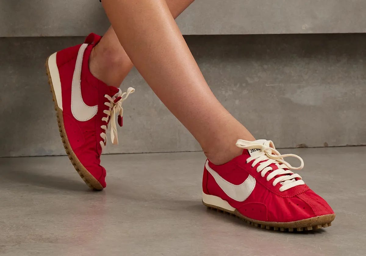
This is not the kind of style advice a wheel or a colour palette can tell us. I think it’s something we just feel, in the wardrobe, when we pay attention. When we play.
Seeing in Colour; Seeing Colour
Which brings us back to colour theorist Albers:
“What counts here—first and last—is not so-called knowledge of so-called facts, but vision—seeing.”
This isn’t an argument against colour systems, or trends, or even “pops of colour.” They’re useful precisely because they start to train the eye. They are heuristics. They get us focused. They make us notice when something works and when it doesn’t. And they challenge us in the beginning too.
But they are starting points.
Because once we begin to see colour as relational—to the rest of our outfit, to our own colouring, to the environment we’re living in—we can accept that there is no stable standpoint. The same outfit will not always feel right. (Ever been let down by a supposedly reliable outfit?) The same colour will not always behave the same way (Ever felt a colour worked like magic in summer, and flopped in winter?). And what works beautifully in a flatlay might fall flat on the body, on a particular day.
We would tend to diagnose this as an outfit failure. But it’s also just a symptom of the slippery nature of colour.
So while we’ve perhaps got quite good at ‘choosing’ colours, I’m happy to concede I’m still learning to really see colours doing their thing.
If anything, all this is about permission. Let’s do the ‘pop of colour’. But also, let’s push on. Play with those combos that don’t immediately hit. Let’s take note of when something feels off and think through whether its intrinsic (something about the colours themselves on our body) or extrinsic (something about the colours we’re pairing with, where we are, where we’re headed, what the weather’s doing, etc!).
And I’m not suggesting Tibi claims otherwise, but it’s nonetheless been helpful, for me at least, to pay attention to the tool’s limitations and blindspots, perhaps especially when its been a great heuristic for early colour experimentation.
There’s so much more that could be said about the presumed universality of colour. For instance, Wierzbicka writes: “Do all people live in a world full of colours? Perceptually, yes (unless they are visually impaired), but conceptually, no: there are many languages which have no word for ‘colour’ and in which the question ‘what colour is it?’ cannot be asked and presumably does not arise.” Wierzbicka, A. (2008). Why there are no ‘colour universals’ in language and thought. Journal of the Royal Anthropological Institute, 14(2), 407-425. (Pdf here).
The real enemy isn’t practicality — it’s “creative" as an excuse for the impractical

Thanks to Tibi (#notsponsored) and Asta Hearts @ Fit Happens for the provocation that encouraged me to put these thoughts down.
What if our neverworns aren't mistakes?

Most wardrobes have a rogue section: the neverworns. Those pieces that live in our wardrobes but never make it into our everyday lives. I know mine does.

We’re not hard to dress. We’re just not the reference.

We can tell when a brand wasn’t designed for our body.
Great article as always!! Tibi's colour wheel is a useful springboard - and, as a lifelong wearer of 'cool' colours (mustard yellow looks truly awful on me - in whatever light/against whatever other colour) it helped me more comfortable with Ring 3 colours BUT that it's the interpretation of how and when you wear the colour and what with that was missing for me - just as you mention, different colours look very different in different situations/light/against other colours/situations etc. I also thought the 'city' colours were just a marketing ploy to get you to buy more stuff if you went travelling! From experience, people in London don't just wear neutrals all the time! Might hold partially true in a job environment but not IRL.
Wow this piece is so thought-provoking. I'm going to have to come back to it again and keep thinking about it!